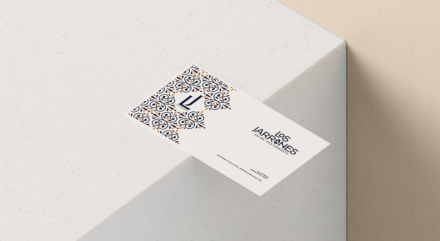
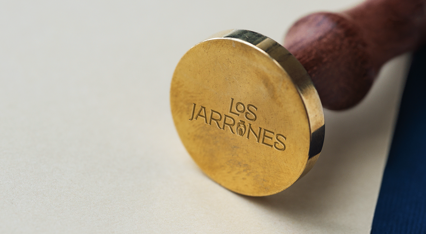
Los Jarrones |Visual Identity
The brand design of Los Jarrones Restaurant is carefully elaborated to reflect the essence of our gastronomic proposal and the unique ambiance of our old house in the heart of Mexico. The predominant colors, blues and oranges, were selected to transmit the energy and warmth of Mexican culture. These tones are inspired by the vivid and vibrant colors of Talavera, an emblematic symbol of the national identity and the city of Puebla. The typography chosen for our logo reflects tradition and elegance, while the inclusion of Talavera elements in the design, from the ornamental vases to the tiles adorning the walls, creates a visual connection to Mexican history and art. Every detail of our brand's design is intended to offer an authentic and stimulating experience, reflecting the fusion of history, art and cuisine that you will find when you visit Los Jarrones Restaurant.